Jupík.
Fun full of fruit.
Overcoming of a negative sales trend thanks to a redesign focused on needs
The Problem
The original packaging won design awards, but didn’t reflect the real needs of its consumers — moms and their children — it was viewed more as a dairy product than a fruit drink. This led to a double digit sales decrease.


Unpacking
We did our own research using KidMap, which mapped our target audience — the children and their parents. Each group wanted something different — the kids wanted fun, while the moms needed to trust that it’s the best for their children. Apparent opposites.
Unpacking
We did our own research using KidMap, which mapped our target audience — the children and their parents. Each group wanted something different — the kids wanted fun, while the moms needed to trust that it’s the best for their children. Apparent opposites.
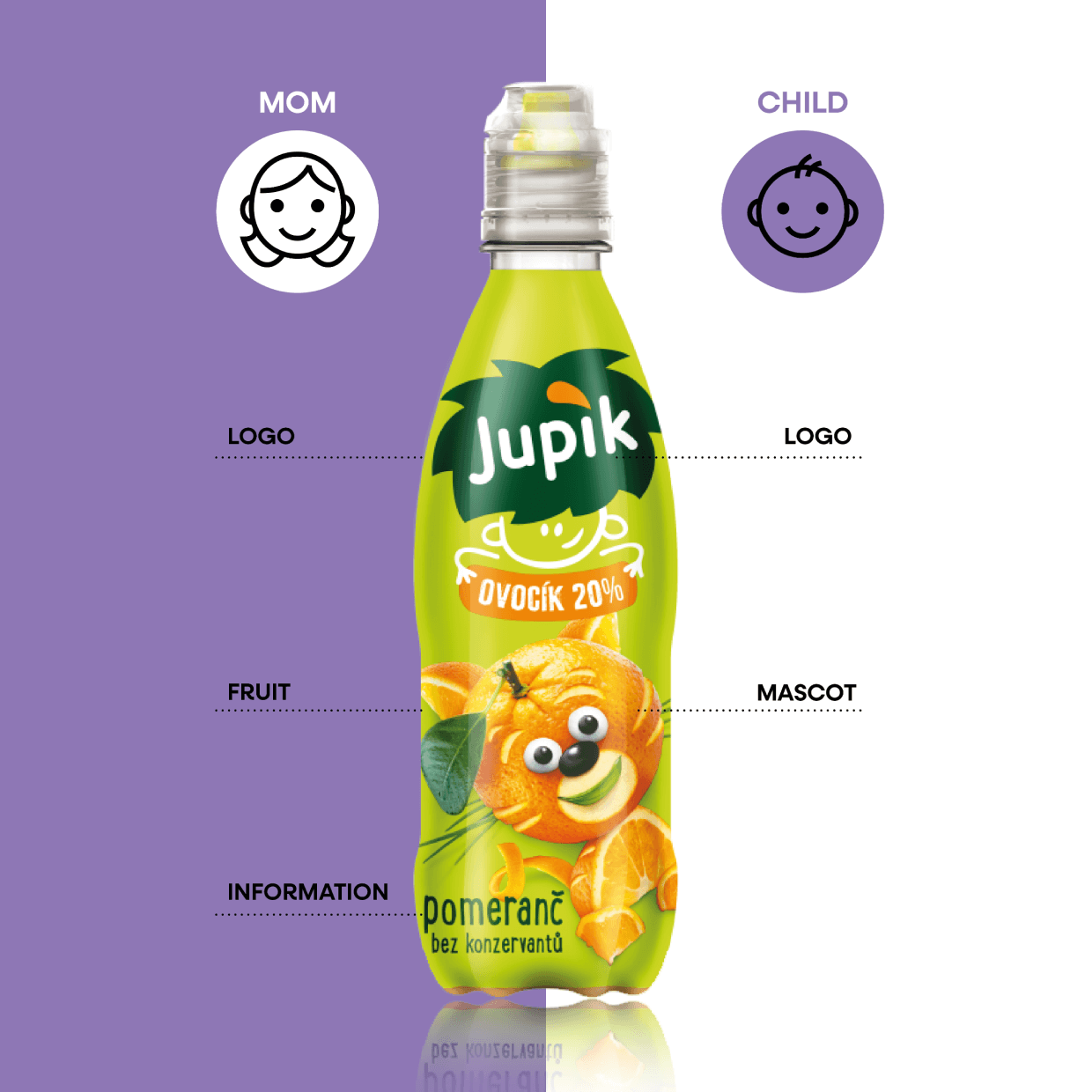
The Discovery
We made a map of the four key symbols for both target audiences:
LOGO: Redesign ensures consistency, is playful, bold and memorable.
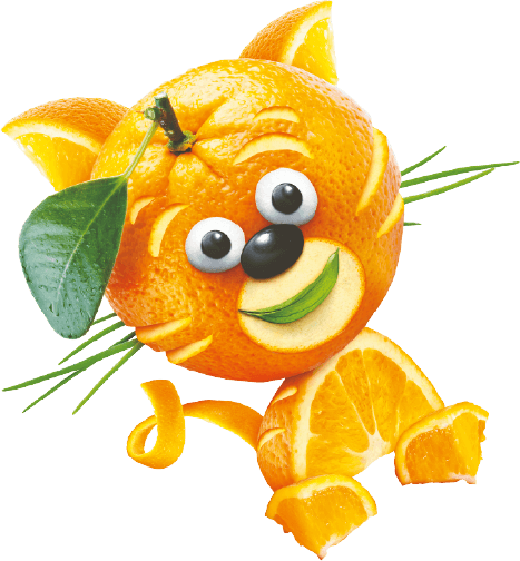
FOR KIDS: Fruit as positive and smiling buddies, made from symbols important to children — ex. big eyes.
FOR PARENTS: Trust through the symbols of nature — photos of fruit with an emphasis on freshness, colorfullness evoking nature, text highlighting natural ingredients.
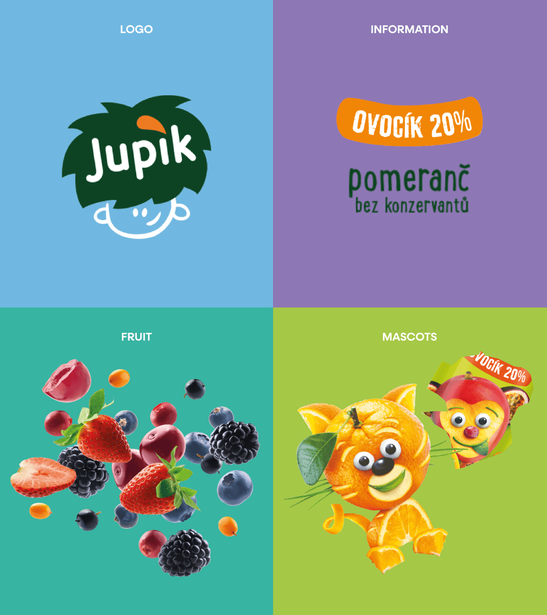
The Discovery
We made a map of the four key symbols for both target audiences:
LOGO: Redesign ensures consistency, is playful, bold and memorable.
FOR KIDS: Fruit as positive and smiling buddies, made from symbols important to children — ex. big eyes.
FOR PARENTS: Trust through the symbols of nature — photos of fruit with an emphasis on freshness, colorfullness evoking nature, text highlighting natural ingredients.
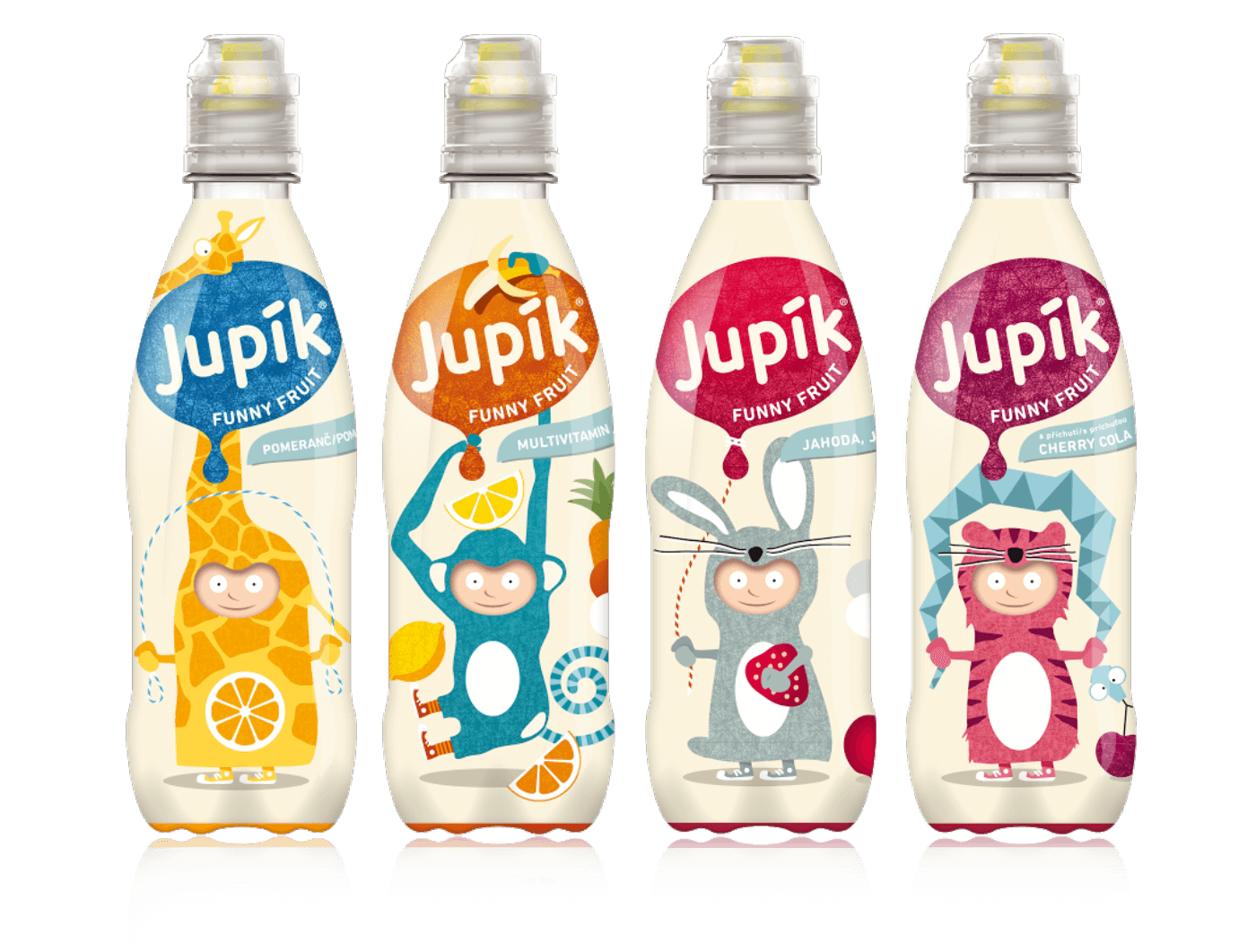
The Solution
Redesign and unification of the logo across product lines added consistency and memorability of the brand.
New design bears the same characteristics of the category and noticeably strengthened recognizability as a fruit drink for children.
Trust in the combination with fun strongly boosted relevance for both moms and children.
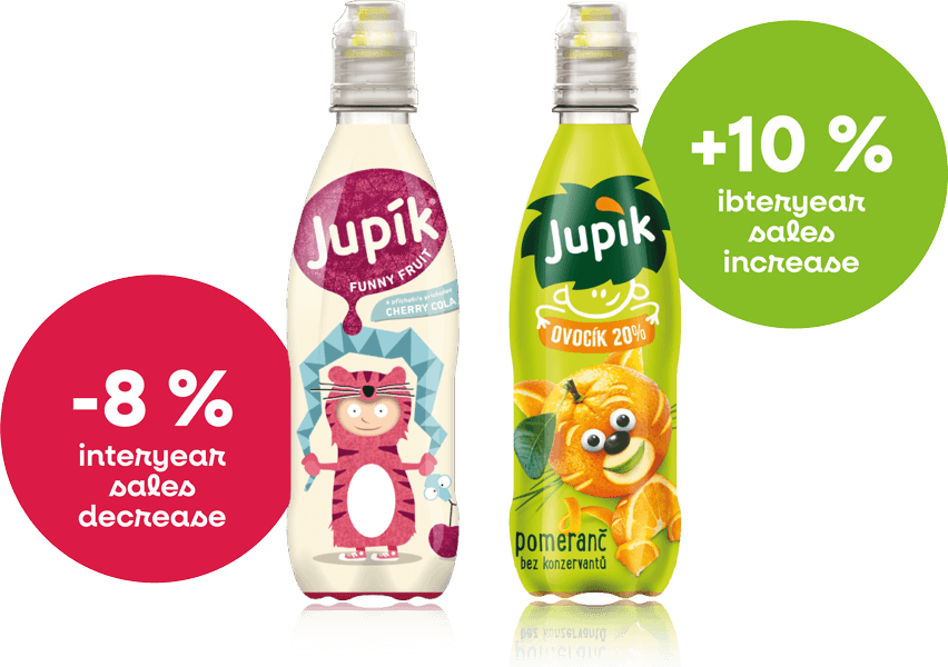
The Results
From interyear sales declines of -8% the brand managed to climb to a +10% sales increase without any marketing aid.
Jupík thus reclaimed their dominant market position.
The Results
From interyear sales declines of -8% the brand managed to climb to a +10% sales increase without any marketing aid.
Jupík thus reclaimed their dominant market position.
What the client said about our cooperation
„Thanks to the new design, we made Jupík into a fruity treat, which was significantly more attractive for parents and the sales shot up without any marketing aid.“

Petr Kouble
Marketing manager, Kofola a.s.
